Color Pencil Guide
Letĺs start with paper. Ideally, you'd want to use Bristol board, which is 100 lb. paper. Very nice to use, but very expensive. If you donĺt have access to that, just about any other type of paper is good, with the exception of computer paper, which is probably the worst you could use. For the picture I'm demonstrating with, I believe I used 70 lb. paper, which is standard sketch pad weight.
For the color pencils, Prismacolors are really the only brand I recommend, although they are pricey. Next best would be Crayola pencil crayons. You can get a box of fifty at Walmart pretty cheap. All of the other brands I've experimented with turned out to be too waxy or had other problems with them.
When you start drawing, your pencil sketch should be light. I sometimes find it helpful to ink first when I'm using paper thatĺs not Bristol Board.
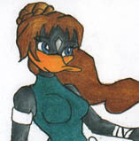
Ginger gets to be our example ;)
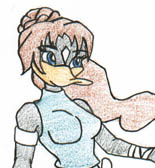 |
Having inked her first, I then lightly applied my chosen colors to the image as I need the white of the paper showing through a bit right now.
Although this may not be necessary (depending on how you may want to colour it), because weĺre going to be adding a lot more layers, we don't want the layers too thick before the picture is finished.
|
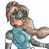 |
Now using the same colors as before, I start shading in the areas I want to be darker. I usually start at the edges, make a dark line and then slowly blend inwards.
Some people would consider their picture at this stage finished. And it is! There are so many cool ways to use pencils, or not use them. It's all a matter of personal preference.
|
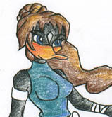 |
Next, I decided to add more color to the lighter spots I left earlier. Yellow in the hair and along the beak, a lighter blue on the clothes, and on the black feathers, I left the white areas alone and used a grey pencil on the darker parts to help smooth it out. Solid black is usually one of the hardest things to color with pencil.
Once again, this is a good place to stop if you like the way it looks now.
|
 |
Darker Coloring
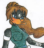
Taking the colors we used in the first step, lightly add a full layer over everything to blend the colors in a bit more and to make the next step easier.
I would not suggest stopping at this step, as the image has no 'body'. |
 |
Now find a color that's between our original color and our highlighting color. If you can't find one, then just stick with your original color. This is where is I completely ignore everything I've ever read about color pencilling and press pretty hard while coloring, trying to make the colors look more solid.
You *can* stop here as well, but if I've gotten this far, I usually like to do the next step as well.
|
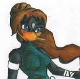 |
Final shading makes the image look rounder. When doing this step, I use complimentary colors: Red/Green, Blue/Orange, Purple/Yellow. I used red to shade the green areas, blue to shade the hair, light blue to shade the beak, etc... It isn't very noticeable online, but in Real Life it helps make the coloring look fantastic!
Finally, add some highlighting with the white color pencil. And if you want to add some extra sharpness to your drawing, you can re-ink it.
|
Tada! The finished project!
Back to Tutorials